
Designing for Real People: An NUS Collaboration
Designing for Real People: An NUS Collaboration
Designing for Real People: An NUS Collaboration

By Emun Yeat
By Emun Yeat
Dec 5, 2025
Dec 5, 2025
Three groups. Three target audiences. Three completely different approaches to the same question: How do you help someone understand what Kita is and why it matters?
This semester, we partnered with Professor Kai Ruo's NM4230 Communication for Social Change class at NUS to tackle our onboarding and outreach challenges. The brief was straightforward – create physical toolkits that communicate Kita's mission and values in ways that resonate with different audiences.
What came back surprised us.
The Challenge: Designing for People, Not Personas
Our work touches multiple groups of people, each needing to understand Kita in different ways. The students split into three groups, each designing for a distinct purpose:
Youth participants: Helping first-timers feel comfortable being themselves while understanding what to expect from Kita
Adult allies: Equipping social sector professionals to confidently introduce Kita to youths they work with
Advocates: Creating shareable materials that help supporters spread awareness and invite others to join the mission
Then they did something most design projects skip.
They listened.
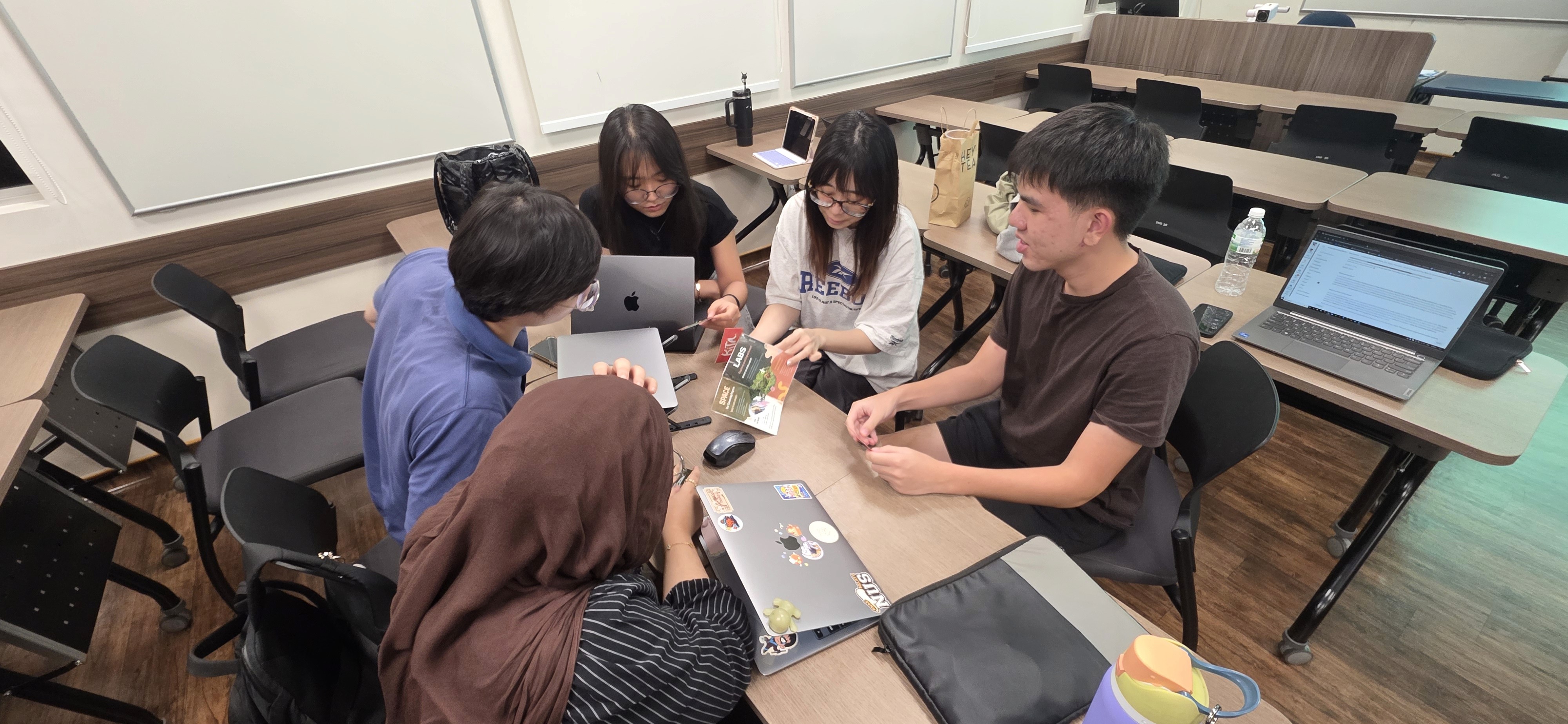
The Process: Assumptions Meet Reality
Wei Ni, one of the students, put it simply, "youths are much more autonomous than we thought. We assumed they lacked agency, but they actually have their own hopes and dreams and wanted to be here. Kita can only help a bit, the youths have to want it."
That realisation came from sitting down with our alumni – Insyirah, Vattey, Sasi and Angel – and asking what their first days felt like.
Uncertain.
Shy.
Wondering if this was too good to be true.
The students heard about pain points in our current onboarding: too wordy, not enough visuals, unclear what to expect.
Ethan attended one of our actual onboarding sessions. Only one participant showed up.
"It was so hard," he reflected. "You're dependent on the receptivity of youths and can't guarantee their attendance. That barrier wasn't as obvious before."
Professor Kai Ruo watched her students navigate this. "They're not really good with physical design stuff, so this was a new challenge. But they were very independent – they tried and tested on their own. I didn't have to give much advice. They made me speechless with the work produced."
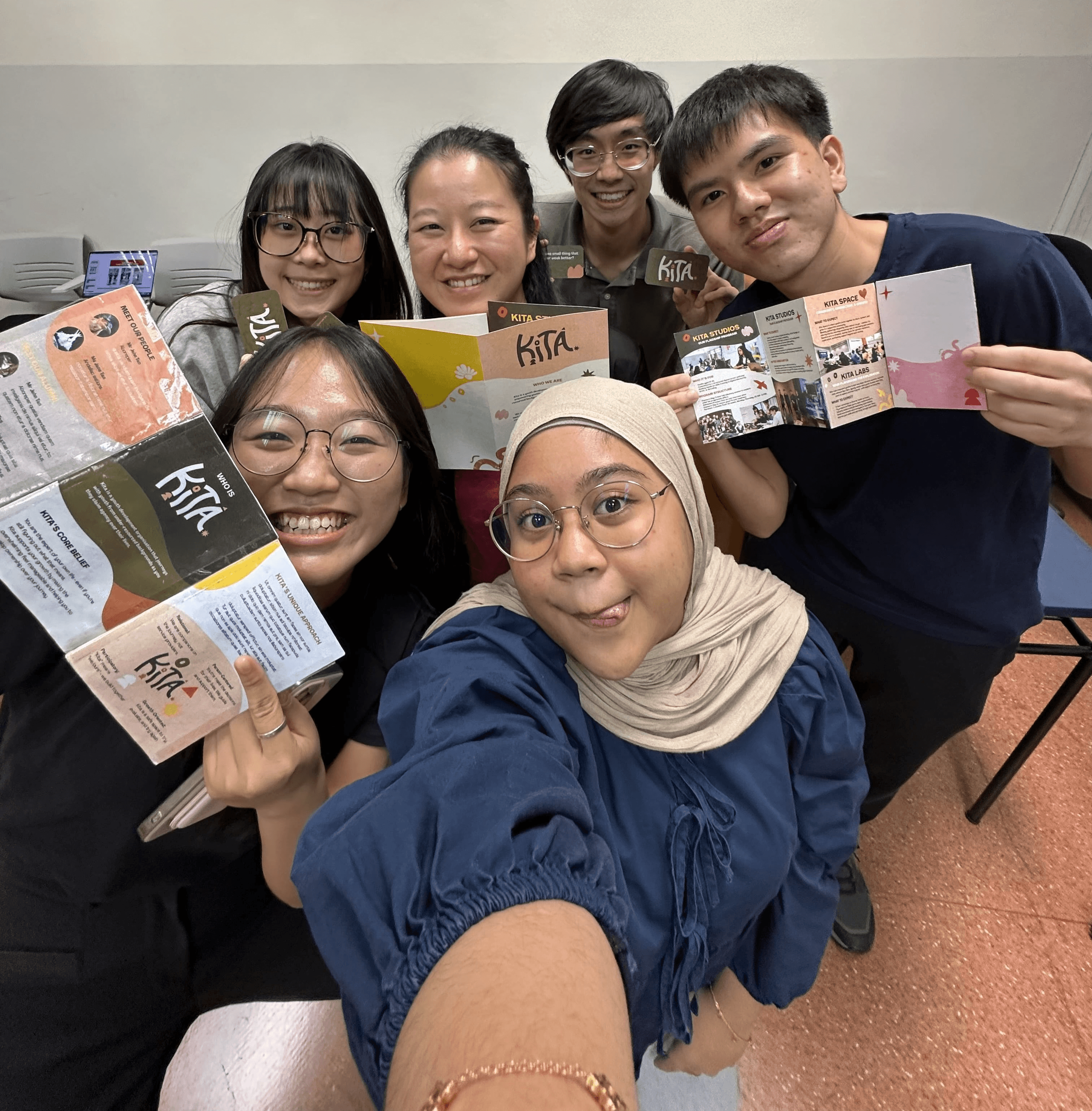
The Solutions: Three Different Doors In
For Youths: A Map and a Shirt
The youth-focused group created an interactive onboarding booklet featuring a roadmap, incorporating Kita's symbols in a way that makes the journey feel tangible, not abstract.
But the standout? A batch shirt.
Wee Teck explained, "it was our first time designing together with Kita. Usually, batches design their own shirts, but we thought – how about we let the youths decide what tagline they want? We don't want to prescribe what that should be."
The shirt wasn’t simply merchandise, it became a blank canvas for agency.
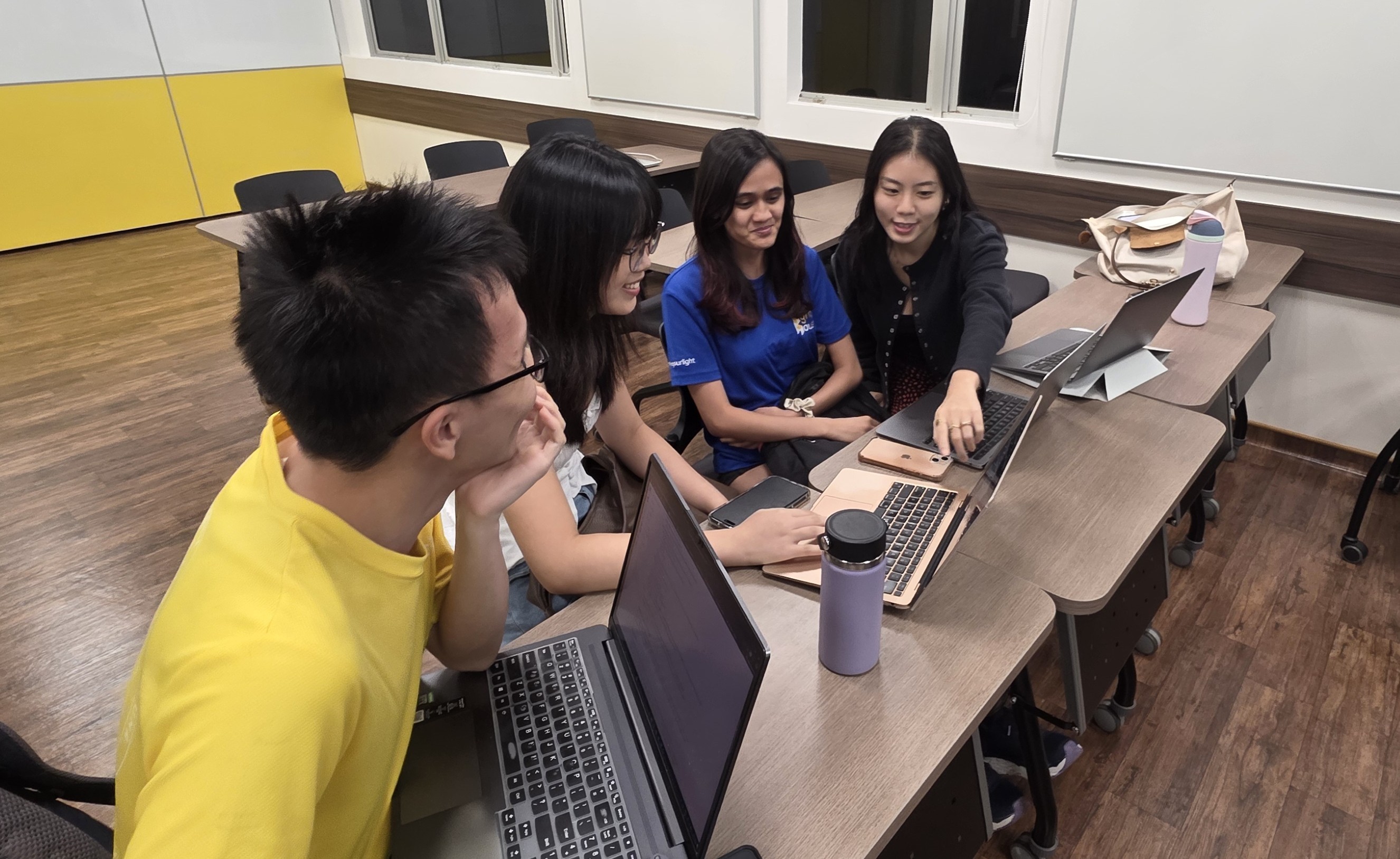
For Adult Allies: Conversation Starters
The adult allies group tackled a tricky challenge: how do you help social workers and mentors introduce Kita without sounding like a sales pitch?
Funnily enough, they were the last group to meet with the Kita team.
"We felt unprepared, like we didn't know what we were doing," one student admitted. But meeting Charmaine, a social worker and one of Kita's real-life adult allies, changed everything.
Getting first-person feedback from someone who actually does this work made the ideas flow. They later told their lecturer they "wished we had met the team sooner."
Their solution: an explanation booklet paired with talking cards that give allies the right prompts and language to introduce Kita naturally when a young person might benefit.
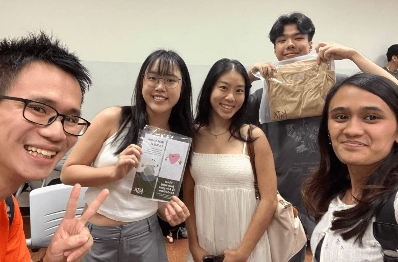
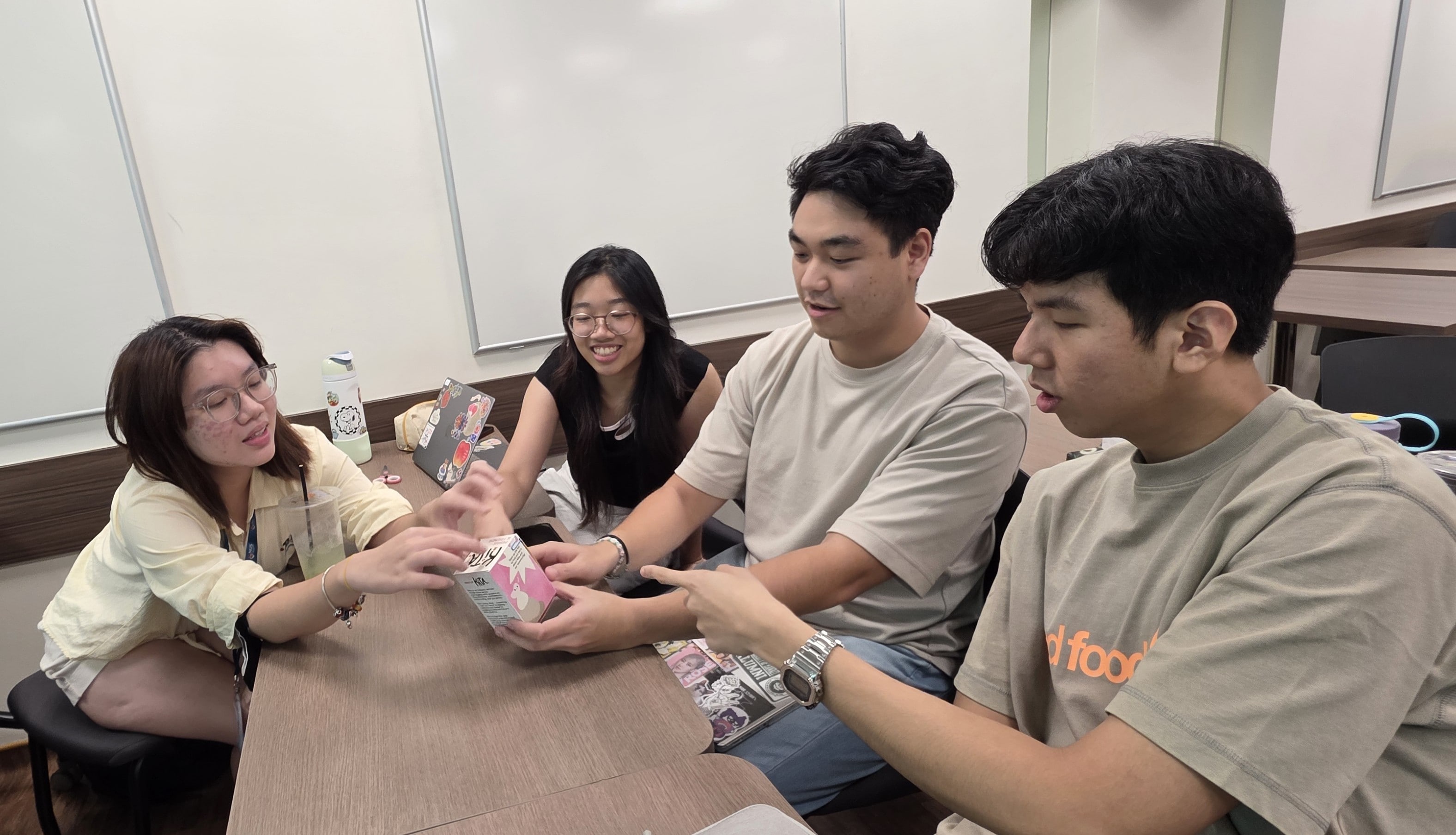
For Advocates: A Tactile Story
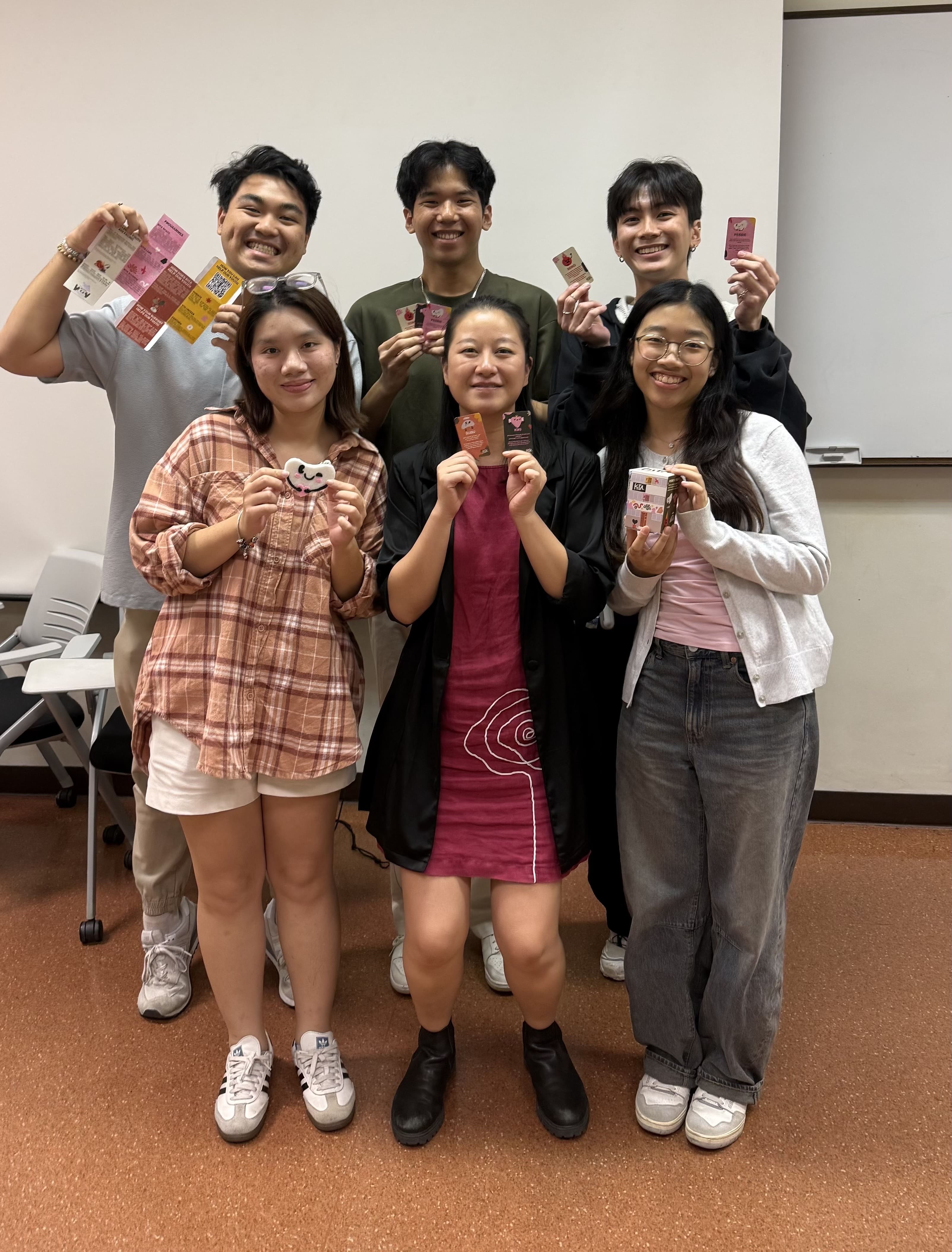
The advocates group wanted to create something people would actually keep and share. Their design: a blind box containing a plushie keychain of one of our mascots. Open it up, and the box itself unfolds to reveal Kita's story, mission and impact data.
"It was fun to incorporate the symbols into something visual that people could actually follow," one student shared.
It's clever – the blind box format creates curiosity and delight, while the unfolding design transforms packaging into storytelling.
Physical, shareable, memorable.
Everything a good advocacy tool should be.
Takeaways
For Professor Kai Ruo, this project embodied the course's philosophy: participatory communication that centers marginalised voices.
The module focuses on how communication can engage with marginalised populations, creating spaces for listening and incorporating culture and participation into development programs.
"The whole philosophy of Kita aligns with the ethos of the course and what students are encouraged to do," she shared. "It was a good reflexive exercise – students were quite open about how working on this impacted them and made them see youths in different ways. The NUS community is what most of them know. It was good for them to see what's available in social impact work."
Wei Ni appreciated the complexity. "It was fun seeing how we work with different stakeholders. There’s so many different aspects we'd never considered! It opened our eyes to how much work is on your plate."
Professor Kai Ruo had one more observation, "I always have these expectations that my students may not know how to do things – that's not true. Give them space to fail on their own terms, to try and experience – that's where they thrive the most. They came up with ideas I shouldn't have been able to think about."
Why It Matters
This wasn't a hypothetical case study. The students designed for real people in real circumstances, tested their ideas with actual participants and delivered prototypes we can use. More importantly, they learned what we try to show our youths every day: when you're given trust, space and real stakes, you rise to meet them.
The toolkits are now in production. New participants will soon hold physical proof that someone thought carefully about their first day, their comfort, their questions. That someone believed their experience mattered enough to design for it.
And a group of university students learned that good design isn't about having all the answers. It's about asking the right questions, and actually listening to the responses.
Three groups. Three target audiences. Three completely different approaches to the same question: How do you help someone understand what Kita is and why it matters?
This semester, we partnered with Professor Kai Ruo's NM4230 Communication for Social Change class at NUS to tackle our onboarding and outreach challenges. The brief was straightforward – create physical toolkits that communicate Kita's mission and values in ways that resonate with different audiences.
What came back surprised us.
The Challenge: Designing for People, Not Personas
Our work touches multiple groups of people, each needing to understand Kita in different ways. The students split into three groups, each designing for a distinct purpose:
Youth participants: Helping first-timers feel comfortable being themselves while understanding what to expect from Kita
Adult allies: Equipping social sector professionals to confidently introduce Kita to youths they work with
Advocates: Creating shareable materials that help supporters spread awareness and invite others to join the mission
Then they did something most design projects skip.
They listened.
The Process: Assumptions Meet Reality
Wei Ni, one of the students, put it simply, "youths are much more autonomous than we thought. We assumed they lacked agency, but they actually have their own hopes and dreams and wanted to be here. Kita can only help a bit, the youths have to want it."
That realisation came from sitting down with our alumni – Insyirah, Vattey, Sasi and Angel – and asking what their first days felt like.
Uncertain.
Shy.
Wondering if this was too good to be true.
The students heard about pain points in our current onboarding: too wordy, not enough visuals, unclear what to expect.
Ethan attended one of our actual onboarding sessions. Only one participant showed up.
"It was so hard," he reflected. "You're dependent on the receptivity of youths and can't guarantee their attendance. That barrier wasn't as obvious before."
Professor Kai Ruo watched her students navigate this. "They're not really good with physical design stuff, so this was a new challenge. But they were very independent – they tried and tested on their own. I didn't have to give much advice. They made me speechless with the work produced."
The Solutions: Three Different Doors In
For Youths: A Map and a Shirt
The youth-focused group created an interactive onboarding booklet featuring a roadmap, incorporating Kita's symbols in a way that makes the journey feel tangible, not abstract.
But the standout? A batch shirt.
Wee Teck explained, "it was our first time designing together with Kita. Usually, batches design their own shirts, but we thought – how about we let the youths decide what tagline they want? We don't want to prescribe what that should be."
The shirt wasn’t simply merchandise, it became a blank canvas for agency.
For Adult Allies: Conversation Starters
The adult allies group tackled a tricky challenge: how do you help social workers and mentors introduce Kita without sounding like a sales pitch?
Funnily enough, they were the last group to meet with the Kita team.
"We felt unprepared, like we didn't know what we were doing," one student admitted. But meeting Charmaine, a social worker and one of Kita's real-life adult allies, changed everything.
Getting first-person feedback from someone who actually does this work made the ideas flow. They later told their lecturer they "wished we had met the team sooner."
Their solution: an explanation booklet paired with talking cards that give allies the right prompts and language to introduce Kita naturally when a young person might benefit.
For Advocates: A Tactile Story
The advocates group wanted to create something people would actually keep and share. Their design: a blind box containing a plushie keychain of one of our mascots. Open it up, and the box itself unfolds to reveal Kita's story, mission and impact data.
"It was fun to incorporate the symbols into something visual that people could actually follow," one student shared.
It's clever – the blind box format creates curiosity and delight, while the unfolding design transforms packaging into storytelling.
Physical, shareable, memorable.
Everything a good advocacy tool should be.
Takeaways
For Professor Kai Ruo, this project embodied the course's philosophy: participatory communication that centers marginalised voices.
The module focuses on how communication can engage with marginalised populations, creating spaces for listening and incorporating culture and participation into development programs.
"The whole philosophy of Kita aligns with the ethos of the course and what students are encouraged to do," she shared. "It was a good reflexive exercise – students were quite open about how working on this impacted them and made them see youths in different ways. The NUS community is what most of them know. It was good for them to see what's available in social impact work."
Wei Ni appreciated the complexity. "It was fun seeing how we work with different stakeholders. There’s so many different aspects we'd never considered! It opened our eyes to how much work is on your plate."
Professor Kai Ruo had one more observation, "I always have these expectations that my students may not know how to do things – that's not true. Give them space to fail on their own terms, to try and experience – that's where they thrive the most. They came up with ideas I shouldn't have been able to think about."
Why It Matters
This wasn't a hypothetical case study. The students designed for real people in real circumstances, tested their ideas with actual participants and delivered prototypes we can use. More importantly, they learned what we try to show our youths every day: when you're given trust, space and real stakes, you rise to meet them.
The toolkits are now in production. New participants will soon hold physical proof that someone thought carefully about their first day, their comfort, their questions. That someone believed their experience mattered enough to design for it.
And a group of university students learned that good design isn't about having all the answers. It's about asking the right questions, and actually listening to the responses.


journey@withkita.sg
+65 8608 6760
11 Prinsep Link
The Foundry
Singapore 187949

Thank you for being part of the Kita community. Your support fuels growth, agency and opportunity for youths across Singapore
© 2025 Kita. All Rights Reserved.
Made with ♥︎ by Angel - Kita Alumni of 2022, Current Web Design Specialist at Hatch Mediahouse
journey@withkita.sg
+65 8608 6760
11 Prinsep Link
The Foundry
Singapore 187949
Thank you for being part of the Kita community. Your support fuels growth, agency and opportunity for youths across Singapore
© 2025 Kita. All Rights Reserved.
Made with ♥︎ by Angel - Kita Alumni of 2022, Current Web Design Specialist at Hatch Mediahouse
